
A reception logo is usually the first permanent brand element a visitor sees inside an office, clinic, showroom or customer area. The sign may look simple in a rendering, yet the finished result depends on more than the logo artwork. Wall proportions, letter strokes, depth, lighting, fixing, cable access and the reception counter all affect how the logo reads in the real room.
The focus here is the reception wall: how to turn approved artwork into a sign that fits the room and can actually be installed. Unusually large signs, suspended work, structural loads and applications that need formal certification require the appropriate engineering review. Site-specific landlord, building-management and authority requirements also need to be checked.
What has to be settled before a reception logo reaches production
| Reception-sign choice | Site or artwork detail to provide | What it changes |
|---|---|---|
| Approved artwork | Vector logo, brand colours and exact wording | Accurate paths protect letter shape, spacing and logo proportions. |
| Wall area | Clear wall width and height, counter height and nearby features | The logo must sit comfortably within the visible area, not only fit on the wall. |
| Target sign size | Overall width or a marked scale on a site photograph | The smallest letters and thin strokes may limit the final construction. |
| Construction | Flat-cut, layered, deeper 3D letters or a panel-backed logo | Changes depth, shadows, edge treatment, weight and fixing. |
| Lighting | Non-lit, halo-lit, face-lit or another agreed effect | Lighting affects material, depth, wiring, driver location and maintenance access. |
| Wall surface | Gypsum, stone, glass, wood, metal, tile or another finish | The fixing method must suit the actual substrate and finish. |
| Language layout | Approved Arabic and English artwork at final relative scale | Translation, reading direction and visual hierarchy should be settled before cutting. |
| Installation conditions | Site access, working hours, lift needs, power and approval status | Installation planning affects time, tools, protection and quotation. |
Start with the wall, not the logo file
A logo can be correctly drawn and still look undersized, crowded or badly placed once it reaches the reception wall. Begin with a straight front photograph of the full wall. Include the floor, ceiling, reception counter, doors, screens, wall joints and any furniture that will remain. A second photograph from the normal visitor approach helps show the real viewing angle.
Measure the clear wall width and height. Then record the counter height and the distance between the counter and the proposed logo centre. Mark any switches, access panels, air-conditioning grilles, stone joints or wall features that cannot be covered. These details help set a useful sign area before anyone chooses letter depth or material.
Use the normal visitor position
Stand where most visitors first face the reception. The logo should read from that point without feeling too high, too low or hidden behind the counter. A sign centred on the wall drawing may not look centred from the entrance. A quick site mock-up can reveal that difference before production.
Check camera and meeting-room views
Reception walls often appear in staff photographs, customer videos and online meetings. Check whether the full logo remains visible behind a seated person or receptionist. If only part of the sign enters the frame, the brand can become hard to recognise. This does not mean the logo must dominate the room. It means its position should work in the ways the space is actually used.
Show the proposed size on the wall
Use low-tack tape, paper templates or a scaled overlay on the site photograph. Mark the overall width and height, not only the centre point. A full-size print of the smallest letters can also confirm whether thin strokes and counters remain practical.
Choose a construction that suits the logo
The artwork should lead the construction choice. A symbol with broad forms may work as flat-cut acrylic. A wordmark with thin strokes may need a different depth, backing or fabrication method. The same logo can also combine more than one method.
Flat-cut acrylic letters and logos
Flat-cut pieces create a clean, low-profile result. They can sit close to the wall or use a small spacer gap. This format often suits compact reception areas, secondary brand walls and logos that do not need internal lighting.
The final thickness should not be chosen from a generic chart. Letter height, stroke width, panel size, fixing points and handling all matter. A thin piece may flex during installation. A very thick piece may look heavy on a small wall.
Layered acrylic
Layered construction uses two or more cut pieces to add colour, depth or a border. A clear front layer can protect printed artwork. A coloured rear layer can create a visible outline or shadow. The layers need clean alignment, suitable bonding and enough edge quality for the viewing distance.
Deeper 3D letters
Built-up or deeper letters create stronger side views and more visible shadows. They can also provide space for lighting components. The depth must work with the smallest letter, not only the largest symbol. Very narrow strokes can restrict returns, LEDs, fasteners or wiring.
Logo panel or backer panel
A panel-backed sign can help when the wall has joints, uneven finishes or limited fixing positions. It can also carry wiring and keep Arabic and English elements aligned as one assembly. The panel becomes part of the design, so its size, edge, colour and gap from the wall should be approved with the logo.
Mixed-material construction
Some reception signs combine acrylic with metal, wood, painted panels or printed graphics. This may suit an interior palette or help with structure. Each material reacts differently to heat, cleaning, weight and fixing. The drawing should identify every visible and hidden component before production.
Decide the lighting effect before fixing the depth
Lighting is not a final accessory. It changes the letter depth, acrylic type, cable route, driver position and way the sign comes apart for maintenance. Confirm the desired effect while the wall is still open or while electrical work can be planned.
Non-illuminated logo
A non-lit sign relies on room lighting and material contrast. It usually has fewer service components and can work well on a wall with controlled spotlights. Check for glare on mirror, gloss or clear surfaces. A finish that looks sharp in a sample may reflect ceiling lights when installed at full scale.
Halo-lit or backlit letters
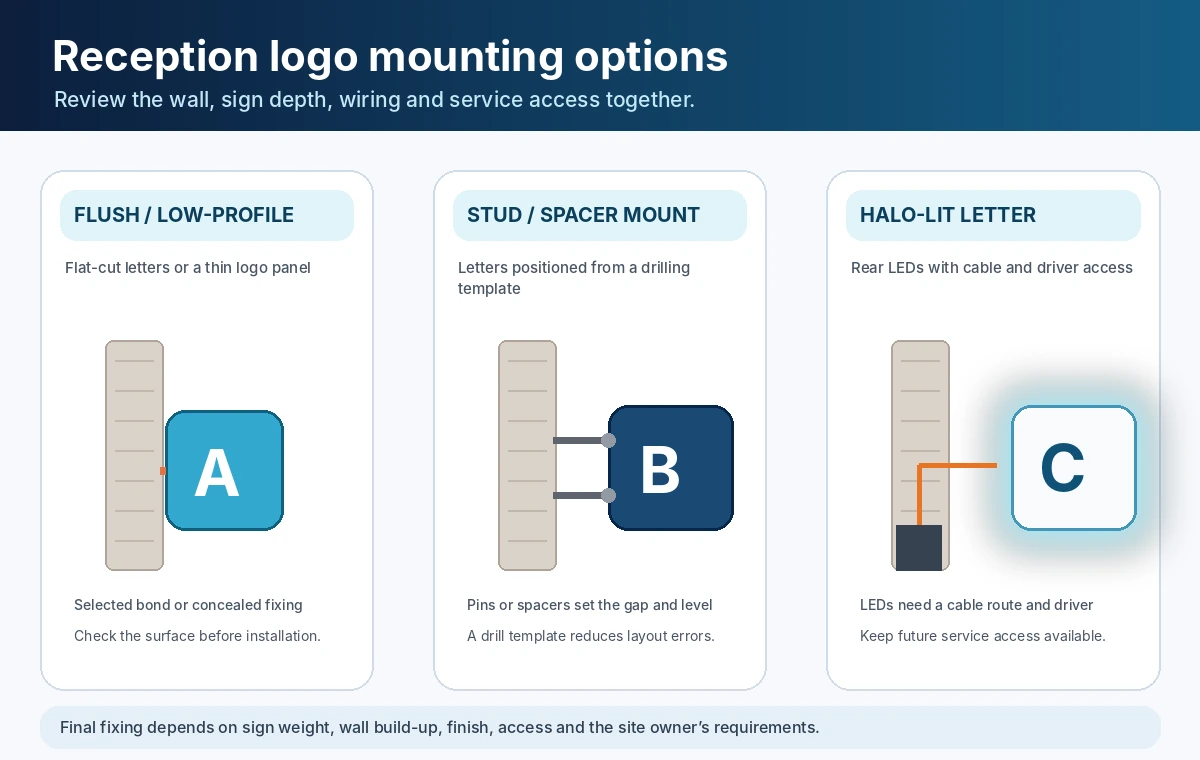
Halo lighting places light behind the letter and creates a glow on the wall. The wall colour, texture and distance behind the letter change the result. A rough stone wall scatters light differently from a smooth painted panel. The gap must also allow airflow, wiring and stable fixing.
Face-lit letters
Face-lit letters send light through the front. The face material, colour and diffusion should be tested with the selected LED. Uneven LED spacing can create visible bright spots. The letter depth should allow a more even light path and practical access to internal components.
Edge-lit acrylic
Edge lighting sends light into a clear or engraved acrylic component. The engraved detail catches the light and becomes brighter. This format may suit selected logos, plaques or smaller reception features. It needs the correct acrylic, edge preparation, engraving and LED position.
Choose a colour temperature with the room
Warm, neutral and cool white lighting can change the way brand colours and wall finishes look. Compare the sign sample beside the actual interior lighting. Do not approve the LED colour from a phone screen alone. If the project uses a specific brand colour, ask for a physical or lit sample when practical.
Plan the driver and service route
Every illuminated sign needs a safe power arrangement and a way to reach components later. Decide where the driver sits, how the cable reaches the sign and which part can be removed for service. Hiding every access point may produce a clean first installation but create avoidable damage during maintenance.
Match the mounting method to the wall
No single fixing method suits every reception sign. The wall build-up, sign weight, letter size, finish and future removal all matter. The installer should see the actual substrate, not only the decorative surface.
Flush or low-profile fixing
Flat letters may use a selected bonding system or concealed fixing where the surface allows it. The wall must be clean, sound and compatible with the chosen product. Dusty paint, loose wallpaper, fresh coatings and textured finishes can affect adhesion. Heavy or valuable signs should not depend on an unverified surface.
Stud or pin mounting
Stud-mounted letters use concealed pins fixed into the wall. A full-size drilling template helps position each item and protect the intended spacing. The substrate must accept the selected anchor. The installer also needs to check hidden services before drilling.
Spacers and standoffs
Spacers create a controlled gap and a stronger shadow line. They may also support halo lighting. The gap should stay consistent across the logo, including smaller letters. Visible hardware must match the approved finish or remain concealed from normal viewing positions.
Back panel or rail mounting
A rear panel can distribute fixing points, carry wiring and reduce the number of holes in a finished wall. It also makes the full logo easier to align as one assembly. The panel should not appear accidental. Its border, colour and depth need the same design attention as the letters.
Glass walls
Glass requires careful planning because rear fixings and cables may remain visible from the opposite side. A second backing piece, decorative film, suspended panel or double-sided construction may help. Confirm glass type, access and building restrictions before drilling or applying any load.
Stone, tile and feature walls
Stone and tiled walls can contain joints, cavities or brittle finishes. The fixing points should avoid weak edges and allow for the actual substrate behind the finish. Share close photographs and, where possible, construction information from the interior contractor.
Plan Arabic and English artwork as one composition
Do not send a Latin logo first and add Arabic text after fabrication has started. Supply the final approved bilingual artwork with both languages shown at the intended size and position. The company or its authorised translator should confirm the exact wording before cutting.
Arabic and English lines may have different visual widths and stroke patterns. Equal font size does not always create equal visual weight. Review alignment, spacing, line order and the relationship between the symbol and both language versions. The smallest Arabic details also need enough thickness for the chosen material and lighting method.
Convert final text to vector outlines
Send an editable vector file and an outlined approval version. Outlines reduce font-substitution problems, while the editable file helps with technical adjustments. Keep a written copy of the approved Arabic and English wording in the project record so spelling can be checked independently from the graphic.
Keep brand rules visible
Provide the brand manual where available. It may define clear space, colour values, minimum sizes, permitted logo arrangements and background contrast. A fabricator can then adapt the construction without changing the identity.
Select acrylic colour and finish with the lighting
Clear, translucent, opal, coloured, mirrored and painted finishes can all produce different effects. The choice should match the lighting method and the wall. A translucent face may suit internal illumination. An opaque colour may suit non-lit letters. Mirror acrylic can add depth but will also reflect people, windows and ceiling lights.
Material thickness and grade should be selected for the individual construction. Clear acrylic is known for high light transmission, but the exact value depends on the product and thickness. Translucent grades spread light differently from clear sheets. Ask for a physical sample when colour or diffusion is critical.
Think about edges
Polished edges can become part of the design on clear letters. Coloured or painted edges may be preferred when the side view should match the face. Layered letters need consistent alignment and clean bond lines, especially where visitors stand close to the wall.
Indoor does not mean temperature never changes
Reception areas near glazed façades can become warm during the day. Acrylic expands and contracts with temperature, so larger panels and long letter runs need suitable allowances and fixing details. The manufacturer’s technical information for the selected sheet should guide the final design.
What to check during a site survey
A site survey should answer the questions that drawings alone cannot settle. The surveyor should see the wall straight on and from the visitor route. Measurements should use fixed site references so the installation team can reproduce the approved position.
- Clear wall width and height
- Reception-counter height and projection
- Wall construction and visible finish
- Existing power point and cable route
- Access above ceilings or behind panels
- Switches, sensors, access panels and hidden services
- Lift, stair and loading access for large assemblies
- Normal site working hours and protection requirements
- Approval status with the tenant, landlord or building management
- Final wall colour and completion date
If the wall finish will change after the survey, issue the revised detail before production. A stone cladding layer, timber slats or decorative panel can alter the finished wall line and the required fixing length.
A practical route from artwork to installation
1. Brief and site information
Send the final logo, wall photographs, measurements, required sign width, lighting preference and target installation date. State whether the wall is complete or still under construction.
2. Technical artwork review
The fabricator checks small letters, thin strokes, counters, joins and spacing. Any change that affects the approved logo should return to the brand owner for written approval.
3. Site survey
The wall, substrate, power, access and visitor viewing point are checked. This stage should also confirm who prepares the electrical point and wall reinforcement.
4. Shop drawing or scaled layout
The drawing should show overall size, individual depth, materials, colours, lighting, mounting, cable exits and the relationship to the wall. A scaled wall elevation helps the client judge the sign in context.
5. Sample where needed
A colour chip, edge sample, lit section or one representative letter can answer questions that a screen cannot. Samples are especially useful for mirror finishes, painted colours, light diffusion and halo distance.
6. Fabrication and dry assembly
The workshop cuts, forms, bonds, finishes and wires the components. A dry layout or template check helps catch spacing and orientation errors before the sign reaches the site.
7. Installation and final check
The installation team protects the work area, transfers the approved layout, completes the fixings and tests the lighting. The client should check alignment, spelling, colour, light consistency and visible cable routes before handover.
What affects the quotation?
Acrylic reception logo pricing depends on the actual build, not only the total width. Two signs at the same size can require very different materials and labour.
- Number of letters, symbols and separate components
- Smallest stroke and detail
- Flat, layered or built-up construction
- Acrylic grade, colour, thickness and finish
- Printing, painting, mirror or mixed-material work
- Lighting type, LED quantity and driver arrangement
- Mounting hardware, drilling template and back panel
- Wall type and installation access
- Site survey, electrical coordination and protection
- Prototype, quantity and required completion date
A useful quotation should state what the client supplies and what the fabricator supplies. Confirm whether electrical connection, wall reinforcement, access equipment, permits, touch-up work and after-hours installation are included or handled by others.
Common mistakes that cause rework
Approving the logo without the wall layout
A letter sample does not show how the full logo sits above the counter. Approve the complete wall elevation as well as the material sample.
Choosing depth before checking the smallest detail
The largest symbol may accept deep construction, while a small tagline cannot. Review the smallest letters before fixing one depth for the full sign.
Leaving wiring until installation day
Halo-lit and face-lit signs need power, cable routes and driver access. Late electrical work can leave visible trunking or require wall repairs.
Relying on an untested wall finish
A decorative surface may hide weak paint, hollow cladding or an unsuitable substrate. Confirm the actual wall build-up and fixing points.
Sending unapproved Arabic text
Do not ask the fabricator to guess a translation or recreate Arabic from a low-resolution image. Send final approved wording and artwork.
Changing the wall after production
New cladding, slats or a thicker finish can move the final wall line. Update the drawing and fixing lengths before fabrication is completed.
Ignoring future access
An illuminated sign may need a driver or LED replacement later. Plan a removable component or access point that does not damage the finished wall.
Reception logo quotation checklist
- Company name and project location
- Approved vector logo and brand guide
- Exact Arabic and English wording
- Wall photographs from front and visitor approach
- Clear wall width, height and counter height
- Target overall sign width or marked scale
- Flat, layered, 3D or panel-backed preference
- Non-lit, halo-lit, face-lit or edge-lit preference
- Wall material and construction information
- Power-point and cable-route details
- Colour and finish references
- Installation access and working-hour limits
- Approval status
- Required completion date
References behind the technical points
These manufacturer pages support the general material, light-transmission, temperature and wall-fastening points in this guide. The exact acrylic sheet, lighting components and fixing system should still be checked for the individual project.
- PLEXIGLAS applications, including visual communication and advertising uses
- PLEXIGLAS light-transmission information
- PLEXIGLAS temperature behaviour and expansion guidance
- PLEXIGLAS wall-fastening methods and substrate notes
Questions that usually come up during reception-sign planning
What logo file should I send?
Send the approved vector file, usually AI, EPS, SVG or print-ready PDF, plus a written copy of the exact wording. Include the brand guide and colour references where available.
Should I choose flat acrylic or 3D letters?
Flat acrylic suits a lower-profile sign, while deeper letters create stronger side views and may allow lighting. The logo strokes, wall size, viewing point and desired effect should guide the choice.
Can an acrylic reception logo be halo-lit?
Yes, where the letter construction, wall and electrical arrangement allow it. Plan the rear gap, LED position, cable route, driver location and future service access before fabrication.
Can the fixing stay hidden?
Many signs use concealed pins, spacers, bonding systems or a hidden back panel. The correct option depends on the sign weight, wall substrate, finish and whether the sign may need to be removed later.
Can Arabic and English appear in the same sign?
Yes. Supply the final approved bilingual artwork with both languages positioned at the intended scale. Confirm spelling, reading direction, hierarchy and the smallest letter details before cutting.
Can the sign be installed on glass, marble or gypsum?
Each surface needs a different review. Glass may expose rear fixings, stone may require suitable anchors, and gypsum may need reinforcement. Send site photographs and wall-construction details before the fixing method is confirmed.
Where should the power supply for an illuminated logo go?
The driver should sit in an accessible, ventilated location agreed with the electrical and interior teams. The cable route and service method should be shown on the drawing before the wall is closed.
What should be ready before I ask for a reception-sign quote?
Send the vector logo, bilingual wording, wall size and photographs, target sign width, construction and lighting preference, wall material, power details, site access, approval status and required completion date.
Use the real wall as the final check
Before fabrication, mark or project the proposed logo at scale on the actual wall. Check it from the entrance, waiting area and behind the reception counter. That simple test often exposes size and height issues that a screen mock-up hides.
Bring the approved vector artwork together with wall photos, measurements, the mounting surface, lighting choice, power route and site-access notes. The acrylic signage page covers the broader service; the 3D acrylic letters page and construction guide deal with deeper letter builds.
Have an approved logo and a real wall to work with?
Bring the vector logo, wall photographs, clear dimensions and lighting or power notes together. That is enough to start a useful production discussion.